I’ve always felt a degree of mixed emotions towards PowerPoint presentations. In spite of their advantages, lots of listeners continue to find them ponderous and archaic.
I have just read a book by Cliff Atkinson, writer of ‘Beyond Bullet Points’, who believes PowerPoint to be the software device that’s insipid rather than inspiring. It remains, nonetheless, an intrinsic part of modern education and learning. Thus, if you wish to avoid inflicting death by PowerPoint, let’s look at what you can do to keep your presentations slick, informative and alive!
Think of each of your presentations as if it was a website.
Shape the structure of your PowerPoint presentation like a website. We all take a great deal of care with the branding on our website – your presentation should be the same. Aesthetic concerns are paramount, and your presentation should look polished and well-designed. Use a theme going throughout and avoid the use of bright contrasting colours, as they will distract your audience from what you’re trying to convey.
Abandon the ClipArt!
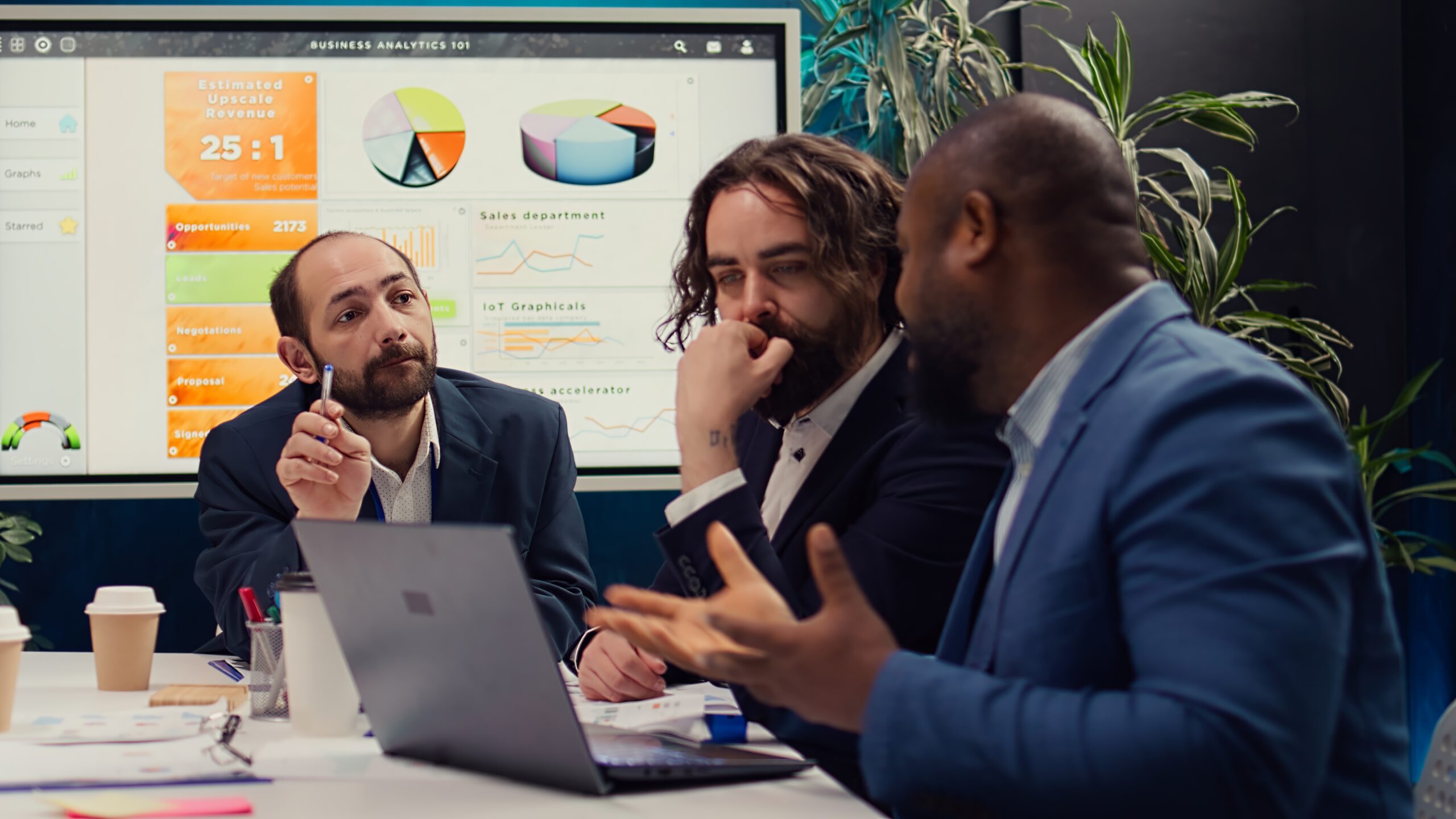
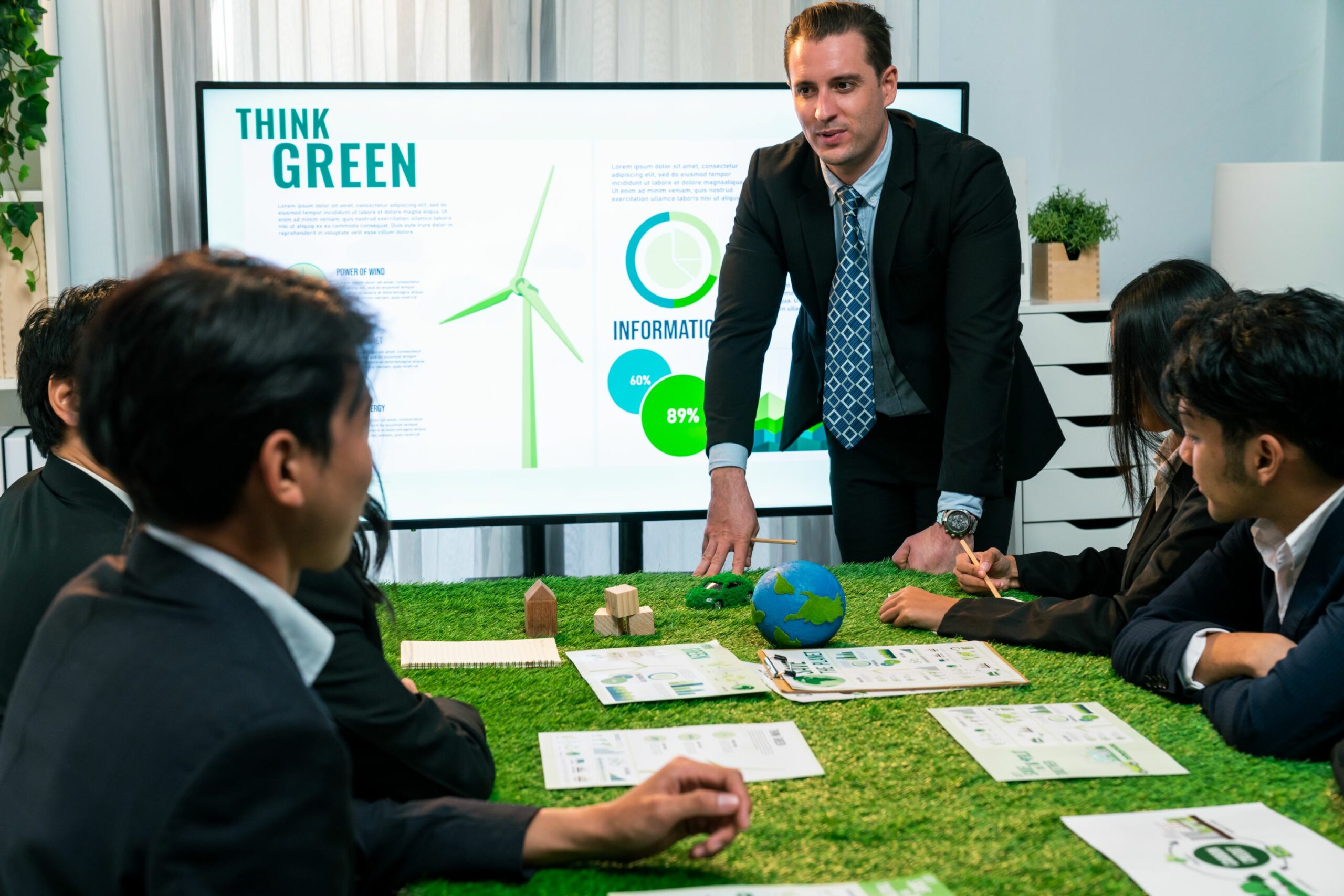
Utilise high grade graphics from stylish stock image sites to add a vibrant quality to your slides. There are several sites where you can buy photos for as little as $1 – a sound investment! Some personal favourites of mine include Stockxpert, Shutterstock and iStockPhoto, however there are lots more out there, so if you are curious, do a search on Google for “Royalty Free Stock Photography”.
Less is More
Don’t crowd your slides with irrelevant text – make them succinct and uncomplicated. Sometimes actions speak louder than words. With PowerPoint, your primary goals is to convey these actions through your images. Your presentation is a visual representation of what you are talking about – not an alternative to the presenter. Even if it’s a simple line or quote, less is often more.
Use 3D
Give your diagrams added interest by making them 3D, and they will visually hold the viewers attention far more than flat, uninteresting diagrams. This works really well with pyramids, and it will make your objects leap off the page, instead of being static and boring.
And Finally… Don’t Over Animate
Going animation happy and overdoing the movement on your template is a definite no no. Having things zooming in from all directions and flying out, rotating around and jumping up and down – will only confuse people. If you do want to use animation in your presentations, stick to simple, no fuss, elegant fading in and out. Leave the flying about to your favourite cartoon characters!
Follow these simple steps and your presentation should be a pleasure to watch, rather than an uncomfortable coffee break, and if you decide that all of this sounds like too much hassle – hire a virtual assistant to do it for you!
Michelle Dale is The Managing Director of Virtual Miss Friday, a highly experienced Executive Virtual Assistant Service which collaborates with businesses and individuals with the sole aim of accomplishing their professional goals. Want to learn more about these comprehensive online business building success strategies? Join the Campaign for FREE Virtual Assistance today!