Excellence, they say, is never an accident. Similarly, a good presentation may look effortless, but it is anything but that! For example, Steve Jobs was a legendary speaker, but his speeches took several weeks of preparation. Wouldn’t you love to be able to make an informative and effective presentation? Over the years, we have found that irrespective of the industry or the caliber of the presenter, all bad presentations are bad for the same reasons. Here’s a list of some of the common presentation mistakes that you can avoid:
Not Using Relevant Images In The Presentation:
We now know that images are an important aspect of presentations. But irrelevant images can be as helpful as adding bullet points or default clipart to your presentation slides. Mind you; we’re not talking about quality images – that’s a given! If you cannot find images with proper resolution and adequate size, you might as well not add them at all. Even stock photos will do as long as they are relevant to the message and stand out. Check pixabay.com if you’re looking for good quality, free stock images – they have thousands of them. Before you finalize on an image, take a quick look to understand if the image is relevant and accents your message. Does it add to your narrative? Is it evocative? And most importantly, is it positioned appropriately? A relevant and unique picture can fall apart if it’s arranged poorly – this is especially true when using multiple pictures
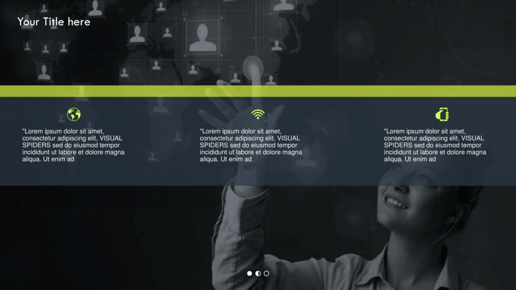
Look at the example below. Use of Images enhances the quality of the slide to a different level

Not Using Diagrams To Help The Audience Walk Through Essential Information:
Presentations stick the least when they’re filled with too many facts and information. Rather than filling slides with facts, how about focusing on what these facts mean? Graphs, pie charts, and other diagrams can be used to explain how and why something happened, instead of rambling about the results of your analysis. Diagrams not only enhance the visual appeal of a presentation but also convey the message more efficiently. But, too much of charts and graphs can be overwhelming as well. The key is to use them as you would use spice – too much and it becomes off-putting. And when it comes to presenting data, the rule is to present them in a simple and clear way. Stay away from fancy special effects like shadowing or shading, and try and remove duplicate labels.
If you’re looking for some free PowerPoint diagrams and slides, try SlideCEO.com. The website offers excellent PowerPoint templates and also updates its slide designs every week. There are plenty of categories that you can pick from, viz. marketing, sales, SWOT, shapes, process diagrams, analysis, timeline, and much more.
Business PowerPoint Template Collection in SlideCEO

Crappy Design With No Sense Of Visual Appeal:
How many people have we met who claim to like staring at texts the way others would stare at images? We all know and understand that text is boring and takes time to read; yet, 8 out of 10 presentations have too much text on slides. Perhaps, out of habit, the audience may read the text, but they won’t be listening to you – because they’re reading. A good presentation focuses on the design elements with high-quality graphics and relevant images. Good presentations are concise and consistent – they do not use a different font or color scheme for every slide. When planning the design layout for your presentation, take into account the place where you’ll be presenting your slides. For example, a dark background with light text works in a dark room, whereas white background with dark text works well for a brightly lit room. Pick a color scheme that matches with your logo, or stick to a minimal color palette of about three or four colors. If you are not sure about using them, stick to black and white.
Look at the slide below. High quality design and visual appeal instantly catches the attention of the audience
And if you want professional help, hire us! At Visual Spiders, we have been designing powerful PowerPoint presentations for more than 10 years now!
Lacks Humor:
Humor is a great way to keep your audience interested. This is especially true if you’re trying to convince a hostile audience. Researchers have found that humor can make people drop their defenses and make them more likely to agree with your view. But this isn’t an excuse to channel your inner comedian. Studies suggest that using humorous anecdotes and stories are more likely to create a positive impact than jokes. Self-depreciating jokes are also appreciated, but hold on before you make fun of people – it could backfire! Use humor to make a point; this way the audience will understand the point you intended to make and appreciate it, even if they do not find the joke funny. Some of the best jokes made during a presentation aren’t random – they have been tested beforehand. If you are not good at humor, try creating a humor file on your computer. Write down funny stories and anecdotes that you say or hear on a daily basis. You can use them later at a presentation when the situation is appropriate.
Lacks A Narrative:
As we earlier stressed, facts are useless unless you can tie them to something interesting – it could be via diagrams or through stories. The main difference between facts and stories is that while facts inform, stories entertain. Look at the presentation content to look for parts that could benefit from a story and find ways to tailor it to suit your audience. For example, if you are speaking before an audience that includes millennial professionals, try incorporating non-traditional elements like working from home, etc. But if your audience includes baby boomers, pick a story that highlights their professional experience.
How do you prepare your presentations? What are the mistakes that you think people commonly make? Share your stories below!